Friday, 26 March 2010

Heatherwick Studio- Blue Carpet

Image: Mark Pinder.

'Consisting of blue glass from recycled Harvey's Bristol Cream bottles set in white resin'
Blue Carpet by Heatherwick Studio won the design competition in Newcastle upon Tyne, UK for the city's first new public square. Before the launching of Blue Carpet 2002, the long narrow site was more of a disused road than a square although it is close to the city's busy inner ring road while surrounded by different types of buildings. After 2002, number of visitors for Laing Gallery in the square has increased by 57%.

The design:
'The space was unified with a single surface using tiles, developed for the project over four years, consisting of blue glass from recycled Harvey's Bristol Cream bottles set in white resin. The surface articulates around trees and distorts as it meets buildings, and is perforated around bollards and peeled back to form benches. The square's trees, imported from Germany and Holland, were the largest ever imported and transplanted in this country.
The studio also designed a new staircase into the square, a spiral of laminated wood fabricated in situ by a firm of traditional Tyneside boat-builders.'
- Heatherwick Studio.

Blue Carpet went on to win a D&AD silver award and The Worshipful Company of Paviours' annual prize.
Image: Mark Pinder.

a+.   heatherwick studio
a+.   mark pinder
Read more...

Thursday, 25 March 2010

Wiggle Side Chair by Frank Gehry

1972, using corrugated cardboard and edges made of hardboard as main material, as he is well known for his use of materials, Frank Gehry designs the Wiggle Side Chair which come in dimension 870×350×610 mm.
'With his "Easy Edges" furniture he succeeded in giving a new aesthetic dimension to such an everyday material as cardboard. Despite their appearing bafflingly simple, the "Easy Edges” are nonetheless constructed with an architect's care and are extremely robust and sturdy. Having given them a makeover from the world of colour, Gehry has given the "Easy Edges" a new dimension - colourfulness.'
- Vitra.
Do check on the Wiggle Stool too!

Wiggle Side Chair.

Wiggle Stool.

'With the furniture series Easy Edges, Frank Gehry gave a new and surprising aesthetic dimension to cardboard, an everyday material. Although they look amazingly simple, the pieces in Easy Edges pieces owe their robustness and structural stability to the architectural quality of the designs. The Wiggle Stool is vaguely reminiscent of traditional African stools and — like such predecessors — makes an attractive accent in any interior.'
- Vitra.
Dimension: 406 × 430 × 400 mm

a+.  vitra
a+.  gehry partners
a+.  wikipedia

Read more...

Monday, 22 March 2010

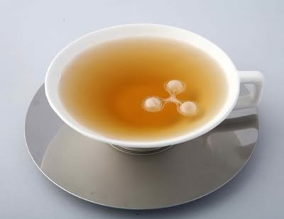
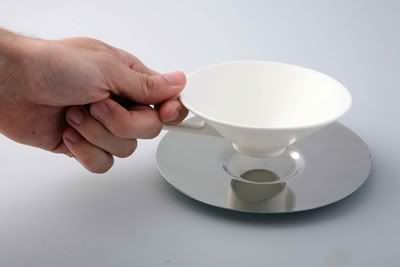
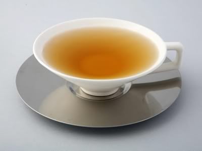
Tea = time + Sugar = time by Erez Bar-am

Tea = time 4
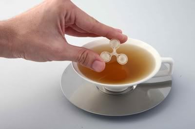
Tea = time + Sugar = time.

A recent graduate from the Shenkar College of Engineering & Design, Israeli designer Erez Bar-am designed this marvelous Tea = time + Sugar = time to helping us slow down in living this fast lane of life, help us relax and enjoy our tea slowly...

What capture me the most is Sugar = time...
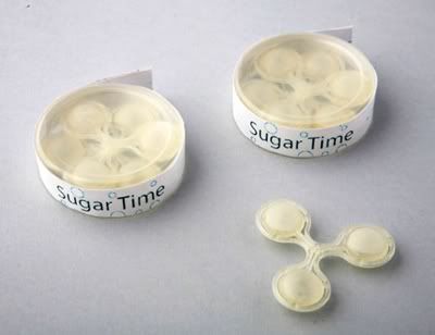
the sugar bubbles which has been designed to float and disintegrate slowly for 10 seconds, creating little bubbles on the surface of your tea during the process itself.

Tea = time is a cup made of porcelain with a broad opening accompany with a coaster made from stainless steel. Together, Tea = time + Sugar = time will give you the leisure to enjoy tea time you deserve...
Tea = time 1Tea = time 2
Sugar time
Sugar = time.

Tea = time 3Tea = time 5
a+. erez bar-am via via
Read more...

Sunday, 21 March 2010

Kopi Luwak Packaging by Colin Dunn

Kopi Luwak 1Kopi Luwak 2
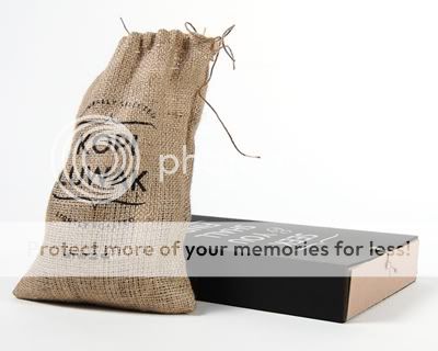
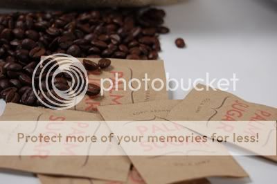
I love this lovely down-to-earth packaging by Colin Dunn for the world most expensive coffee, Kopi Luwak which can cost as much as $600 per pound. The burlap coffee bag, carryout box and sugar packets were handmade for Colin's imaginary very posh cafe named KOPI. While doing research for his final project in Graphic Design I, Colin Dunn discovered Kopi Luwak. He then came out with this packaging and concepts:

'KOPI operates as a “pop-up” café, moving from city to city and distributing from unadvertised locations. In keeping with the secrecy of the brand, the logo doesn’t appear anywhere on the packaging. However other brand elements such as color, typeface and the holding shape of the logo are utilized. When these elements are introduced into public they would indicate to the informed consumer that KOPI is nearby, if only temporarily.'
Kopi Luwak 3Kopi Luwak 4Kopi Luwak 6
Kopi Luwak 6
KOPI, an imaginary very posh “pop-up” café by Colin Dunn.

a+. kopi luwak
a+. colin dunn via
Read more...