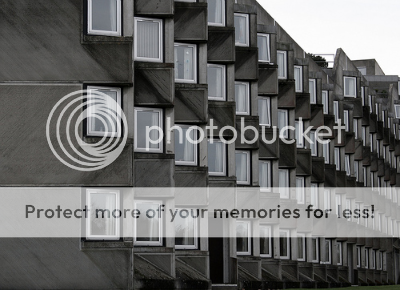
Andrew Melville Hall, design by James Sterling which had aged and weathered well with overgrown moss and lichen, had survived 40 years of age after it was completed in year 1968. A bold move by Sterling to use prefabricated concrete at that time, quoting what Simon Henley of Buschow Henley Architects said,
"It deals with things I find interesting such as the culture of the institution. It’s not a pretty building, but it is heroic and dramatic."
James Stirling and Louis Kahn was Simon Henley mentor, not face to face, but through their work. He studies their plans and visits their buildings. Revisiting Andrew Melville Hall has a great influence on him, especially the psychological/communal aspect of buildings, what he like to call the anthropological — the rituals and behaviours of communal living. Like other buildings, Andrew Melville Hall have had technical flaws too. It leaked and a secondary glazing have been done to make the promenade more comfortable. But considering the time it was built, maybe it was more acceptable to just be cold or to spend more money on heating.


'It’s a bold example of prefabricated concrete. Assembly was an industrialised process, with a crane on wheels dropping the precast wall panels into place. There are a lot of interfaces — corners, sills, small sections of flat roofs, parapets, flashings and overhangs, and lots of open joints in precast panels — so it had plenty of possible places to fail.
The jointing of the panels doesn’t just occur anywhere but where it should — in a corner. As a result, the panels and their jointing made sense of the plan and sculptural form. And the ribbing is a way of covering imperfections in the precast panels so that the concrete has grain, like timber.
On one level, it’s very idealistic. Stirling recognised the possibility of the landscape by positioning the building right on the escarpment between the coastal plain and the plateau, then created a great mid-level promenade. He took the topology and accentuated it from four storeys to eight, and accentuated the sense of landscape.
You’re really aware of belonging to this great congregation of people. Everyone shares a view inward, of each other, and outward, to the sea. It’s about the lonely relationship with the landscape and the social one with friends — written right into the plan of the building. It deals very well with the notion of society — everyone congregates at the apex of the building and at the promenades out into the two wings.
Its visual qualities are as much about looking from it as looking at it. It’s like an optical instrument — everywhere you sit, it’s like putting on a pair of binoculars with the views. The relationship between inside and outside space has a huge impact on the experience of being in a building, and you can see that here — you can’t help but be engaged by the view.
People say it has associations with ships. Personally, I think it’s more like a monastery — both live an isolated and a communal life.
One of its biggest questions is the isolation. It doesn’t belong to the city, but to the place, the topography. It has a primordial connection with the landscape. You could interpret this removal from the town as a physical manifestation of the legitimate removal of students from the rest of society.
What’s really interesting is how it touches the ground. The battered, moss-covered base is more reminiscent of motorway engineering. I also like to think it is reminiscent of the bases of rusticated renaissance palazzos. It’s very heavy on the ground, with the strong horizontal lines and the diagonal lines in the concrete all playing against the topography.'
-Simon Henley interviewed by Pamela Buxton, bd online.The jointing of the panels doesn’t just occur anywhere but where it should — in a corner. As a result, the panels and their jointing made sense of the plan and sculptural form. And the ribbing is a way of covering imperfections in the precast panels so that the concrete has grain, like timber.
On one level, it’s very idealistic. Stirling recognised the possibility of the landscape by positioning the building right on the escarpment between the coastal plain and the plateau, then created a great mid-level promenade. He took the topology and accentuated it from four storeys to eight, and accentuated the sense of landscape.
You’re really aware of belonging to this great congregation of people. Everyone shares a view inward, of each other, and outward, to the sea. It’s about the lonely relationship with the landscape and the social one with friends — written right into the plan of the building. It deals very well with the notion of society — everyone congregates at the apex of the building and at the promenades out into the two wings.
Its visual qualities are as much about looking from it as looking at it. It’s like an optical instrument — everywhere you sit, it’s like putting on a pair of binoculars with the views. The relationship between inside and outside space has a huge impact on the experience of being in a building, and you can see that here — you can’t help but be engaged by the view.
People say it has associations with ships. Personally, I think it’s more like a monastery — both live an isolated and a communal life.
One of its biggest questions is the isolation. It doesn’t belong to the city, but to the place, the topography. It has a primordial connection with the landscape. You could interpret this removal from the town as a physical manifestation of the legitimate removal of students from the rest of society.
What’s really interesting is how it touches the ground. The battered, moss-covered base is more reminiscent of motorway engineering. I also like to think it is reminiscent of the bases of rusticated renaissance palazzos. It’s very heavy on the ground, with the strong horizontal lines and the diagonal lines in the concrete all playing against the topography.'


a+. bdonline via
Read more...