Saturday, 7 March 2009

DIY Homemade Vanilla Favors by Twig & Thistle

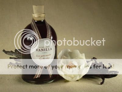
DIY Homemade Vanilla Favors 1DIY Homemade Vanilla Favors 2I really love the way Kathleen, from Twig & Thistle do the packaging for this DIY Homemade Vanilla Favors for Style Me Pretty's DIY Project contribution. Although it might takes about 2 months for the vanilla to mature, with just a few ingredients, materials & simple guided steps, u can get these pretty things done up for homemade gifts that would last for years.

DIY Homemade Vanilla Favors 3DIY Homemade Vanilla Favors 4DIY Homemade Vanilla Favors 5DIY Homemade Vanilla Favors 6Materials:

Small Glass Jars
#4 Size Corks
Mini Gingham Ribbon
Sticker Paper
Scissors
X-acto Knife
Homemade Vanilla


Instructions:

1. For the Homemade Vanilla Extract follow the recipe from Elise, Simply Recipe and directions on how to make it.
2. For vanilla labels just like above, download Vanilla Labels here and print onto white sticker paper. Trim out each label. To get nice circles, take your time and use an x-acto knife and self-healing cutting mat - your fingers and table, or u can simply design your own label for it!
3. To get ribbon just like above, cut a 8" long ribbon and wrap around the neck of the bottle crossing in the center. Secure ribbon with a small piece of tape and then apply Vanilla label to the center of the bottle. Finish it off by snipping the ends of ribbon to a point.
4. Once Vanilla is prepared and ready, fill the jars with vanilla using a funnel and cap with a cork.

a+. twig & thistle
a+. simple recipe via style me pretty
Read more...

Friday, 6 March 2009

RKNL Furniture Studio- In-style with Clean Lines + Soft Shapes

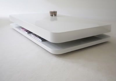
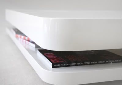
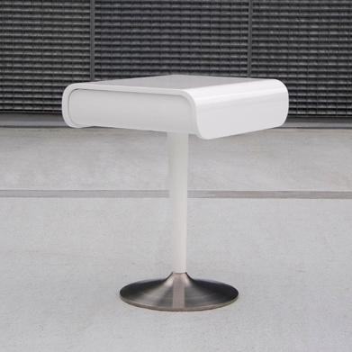
Salontafel RKNL20 Table 1Salontafel RKNL20 Table 2"RKNL furniture studio - symbiosis of form and foundation."

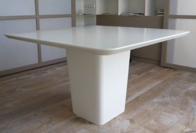
Clean + straightforward + soft shapes just like the above, Coffee Table 20 or Salontafel RKNL20 Table. This white lacquered table designed by Ronald Knol for Odesi, came with 2 white lacquered discs of different thicknesses with the one on the top giving the impression of floating over the lower support, leaving a gap in between to be filled up with books, remote control or other things that we usually range in a coffee table. At €1380, it is available in square + elongated shape from Odesi.


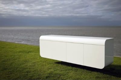
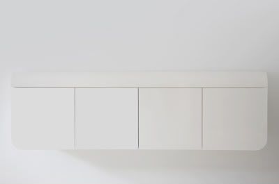
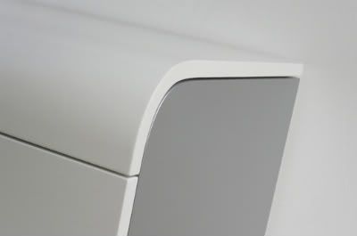
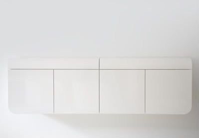
Sideboard RKNL21 1Sideboard RKNL21 2Sideboard RKNL21 3
Sideboard 21 was conceptualized from the drop of fluid motion, the opposite directions of the curves is in a 3-dimensional S-shaped that gives the cabinet an elegant character. Came in 180 x 40 x 55 (W x D X H) it is priced at €2700.


Small Table 21 1Small Table 21 2Small Table 21 is an elegant + distinctive occasional table.


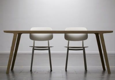
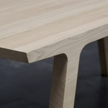
One Table 1One Table 2Available in 195 x 95 x 74 (D x W x H), One Table is a table with 2 faces: cool + elegant. The long side of the table has a soft silhouette, while the short side looks tougher & almost truncated in form due to material used, which is solid oak with an emphasize on the way the wood grain runs: across the table in 1 direction, looking almost like it was made from 1 whole log.

Besides the 4 collection above, RKNL also makes custom furniture in close cooperation with customers to ensure their clean + straightforward + soft-shapes stye meets their client needs too.
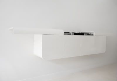
DJ Furniture 1DJ Furniture 2
The DJ Furniture is a variation from Sideboard 21 with 180 x 40 x 55 (W x D x H) in dimension.


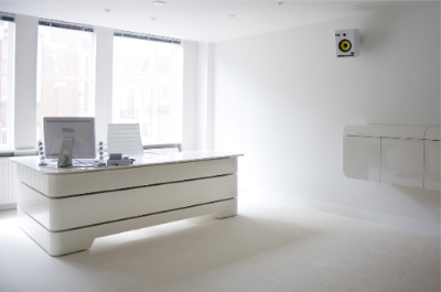
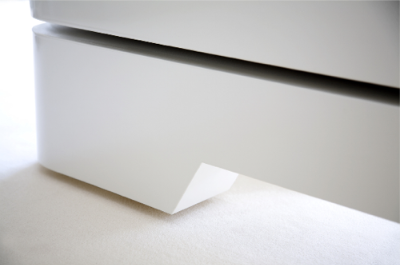
Office 1Office 2This is one of RKNL-style furniture for a modern high-management firm with a clear reference for art-deco.

Central TableAnother nice special piece of central table for a client.
a+. rknl furniture studio via daily icon
a+. odesi
Read more...

Thursday, 5 March 2009

The Pure, Frankfurt, Germany

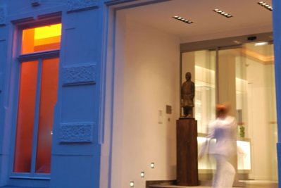
The Pure hotel 0The Pure hotel 1 Browsing through Richard Powers, a renowned photographer's site, the crispy clean images lead me to The Pure, a member of Design Hotels in the heart of Frankfurt, Germany. Scharnberger Architects and Oana Rose refurbished a 19th century loft to create
"a hotel which both captures and expresses the open-minded, cosmopolitan spirit of the city."
- Design Hotels

The hotel can be divided into 3 different spatial functions, the living space, the free & the individual space.

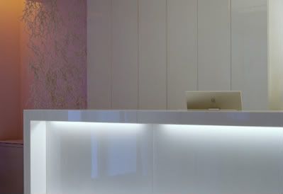
The living space is where the lobby, breakfast room, the bar & the lounge with exclusive choice of bright and clear material such as white lacquer, Thassos Glass Stone, white leather and light grey floor + the effect of the room' s width, interact as one harmonic unit. "The hotel itself will become no more than a background attraction in the guests' eyes, while the happenings around will be focused."
- The Pure's concept.

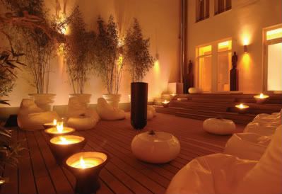
The free space is where The Pure' s patio is. Trick fountains, fat boys, timberteck decking, comfortable stairs to sit on, bamboo and mirrors support the communication and interaction of guests.

The idea of space without borders is continued in the individual space, the hotel rooms. The height of the ceiling, the use of bright material, custom made Plissee lamp shades that come straight from the ceiling, and partially glazed bathtubs make the clients feel as free as possible. The choice of high gloss Zebrano as well as parquet made of high quality oak make the rooms appear silent as well as balanced and very comfortable.
The Pure hotel 2The Pure hotel 3The Pure hotel 4The Pure hotel 5The Pure hotel 6The Pure hotel 7The living space: the lobby, breakfast room, the bar & the lounge.

The Pure hotel 8The Pure hotel 9The individual space: The Pure's rooms.

The Pure hotel 10The Pure hotel 11The Pure hotel 12The Pure hotel 13The free space: The Pure's patio + basement.

The Pure hotel 14The Pure hotel 15The Pure's atmosphere is adjusted to the course of clients, pleasing light and smooth music welcome the guests in quietness as well as vitality in the morning while in the evening, The Pure turns into an oasis full of energy and underlined by visual orange effects.

a+. the pure via richard powers
a+. design hotels
Read more...
Wednesday, 4 March 2009

Tim Wigmore's Upcycled Giddyup Rocking Stool

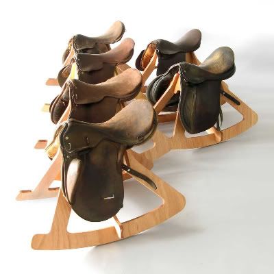
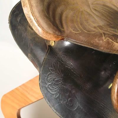
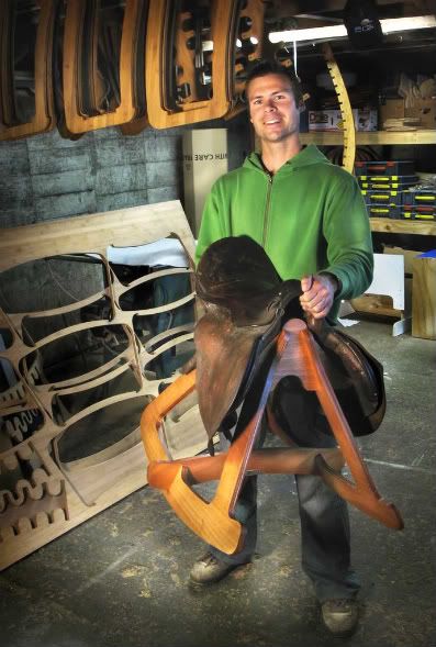
Giddyup Rocking Stool 1Giddyup Rocking Stool 2A very playful yet clever + environmental friendly design, Tim Wigmore's Giddyup Rocking Stool is made from old worn leather saddle, FSC certified gaboon marine grade plywood & natural oil finish.

"Old worn saddles have a beauty and patina of age that I find really attractive. The use of old, tired or broken saddles is an attempt to not only utilize an existing object, but also to elevate peoples perception of the old and pre-used. After having an old broken saddle sitting in my studio for some time I began to consider how I could design a piece that would utilise the beauty of the saddle."
- Tim Wigmore, Clever Bastards.


An active person, i guess, Tim Wigmore's Giddyup developed from exploring less static ways of sitting. In the past, he had used swiss ball to keep his hips & body in motion while working on his computer. Eyeing on the old broken saddle which has been sitting in his studio for quite some time, he decided to combine the history and qualities of the saddle with the idea of 'active' sitting with a hope to provide fun sitting experience for the user.
Giddyup Rocking Stool 3Giddyup Rocking Stool 4Giddyup Rocking Stool 5Tom WigmoreUpcycle

'The term upcycling was coined by William McDonough and Michael Braungart, authors of Cradle to Cradle: Remaking the Way We Make Things.

Upcycling is a component of sustainability in which waste materials are used to provide new products. It is generally a reinvestment in the environment. "Upcycling is the practice of taking something that is disposable and transforming it into something of greater use and value." This process allows for the reduction of waste and use of virgin materials.'
- Wikipedia.

a+. cleverbastards via
a+. tim wigmore
a+. wikipedia
Read more...

Tuesday, 3 March 2009

Church of The Light by Tadao Ando- Simple Stunning Architecture 1o

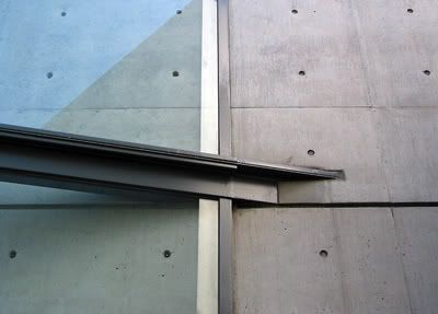
Church of The Light 1Church of The Light 2Church of The Light, sometimes called "Church with Light" is the Ibaraki Kasugaoka Church's main chapel. Built in 1989, in the city of Ibaraki, Osaka Prefecture and design by famous Japanese architect, Tadao Ando who often uses Zen philosophies when conceptualizing his structures. A communal church located in a quiet residential neighborhood in the suburbs of Osaka, the Church of The Light consists of two rectangular volumes that are both cut at a 15 degree angles by freestanding concrete walls. One indirectly enters the church by slipping between the two volumes, the Sunday school and the worship hall.

"One theme he expresses in this work is the dual nature of existence.

The space of the chapel is defined by light, the strong contrast between light and solid...

In the chapel light enters from behind the altar from a cross cut in the concrete wall that extends vertically from floor to ceiling and horizontally from wall to wall, aligning perfectly with the joints in the concrete. At this intersection of light and solid the occupant is meant to become aware of the deep division between the spiritual and the secular within himself or herself.

One of the features of the interior is the profound emptiness.

Many who enter the church say they find it disturbing. The distinct void space and absolute quiet amounts to a sense of serenity.

For Ando the idea of 'emptiness' means something different. It is meant to transfer someone into the realm of the spiritual. The emptiness is meant to invade the occupant so there is room for the 'spiritual' to fill them."
- Wikipedia.
Church of The Light 3Church of The Light 4Church of The Light 5Church of The Light 6Church of The Light 7Church of The Light 8Church of The Light 9Church of The Light 10Church of The Light 11Church of The Light 12ChurchChurch of The Light 14a+. figure-ground (photo courtesy of Liao Yusheng)
a+. wikipedia
a+. galinsky
Read more...