Thursday, 18 December 2008

REK ::Bookcase

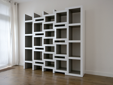
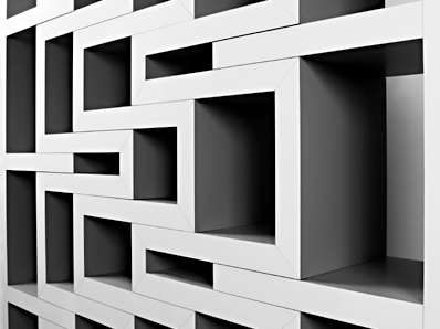
REK 1REK is a bookcase that grows with your collection. The more the books, the bigger the bookcase gets.
REK 2REK 3REK zigzag shaped parts slide in or out to accommodate books in those voids create. Therefor, REK will always be full regardless the quantity of books. Books can be arranged according to size which ever suitable to fill the gap.
a+. reiner de jong via
Read more...

La Estancia Chapel (Chapel in a Garden)- Simple Stunning Architecture 11

La Estancia Chapel 1La Estancia Chapel 2A crystal chapel...
"La Estancia Chapel was designed for a beautiful Mexican colonial garden that caters for weddings."

This simply beautiful garden chapel is located in the town of Cuernavaca,“the city of eternal spring” which is an hour drive south of Mexico City. Previous weddings in the town of Cuernavaca all took place under a light canvas canopy roof since it lacks of chapel. With warm climate, relative proximity to the big city and beautiful gardens, Cuernavaca is a very popular destination for couples from Mexico City.
La Estancia Chapel 3La Estancia Chapel 4Bunker Arquitectura did not like the idea of using air conditioning when the client suggested it, they even consider replacing the glass for other material due to high cost + contamination of its surrounding environment. After subsequent discussions, they realized if they were to separate the U-profiled glass in the manner of lattice-work, they could create a well ventilated space as well as achieving a visual play between the interior and exterior + the site within an enormous area of abundant vegetation, did not require the removal of any of the existing plants or trees, under the large jacaranda trees, which form a natural arch over the chapel and provide it with ample shade, thus reducing temperatures during the day.
La Estancia Chapel 5La Estancia Chapel 6La Estancia Chapel 7"The chapel was conceived in a box and compressed to form a peaked roof. Different shapes were traced on its lateral facades to form a prism which was then subtracted from the main volume. We covered the four facades with U-profiled glass and spaced each piece 10cm. apart from each other. In the altar façade, a cross was outlined and subtracted from the glass veil creating a window that looks out onto the surrounding garden. The exuberant vegetation and tall jacaranda trees permeate through the glass lattice walls, creating a graceful and rhythmical dialogue between the interior and exterior space." -Bunker Arquitectura.
a+. bunker arquitectura via e-architect

Read more...

Amazing Artwork From Yulia Brodskaya

paper-cut illustration from Yulia Brodskaya 1paper-cut illustration from Yulia Brodskaya 2Stunning! Awesome paper-cut illustration from Yulia Brodskaya...

"I’m constantly experimenting and evolving, always pushing my style in new directions: my greatest passion is to explore the ways of combining illustration and typography."
- Yulia Brodskaya.
paper-cut illustration from Yulia Brodskaya 3 -colored
paper-cut illustration from Yulia Brodskaya 4 -whitepaper-cut illustration from Yulia Brodskaya 5 -black Born in Russia, Yulia Brodskaya started out as a fine artist producing contemporary office decoration artwork for Moscow based companies while studying for first degree in Graphic Design. Later, after earning an M.A. in Graphic Communication, Yulia work as an illustrator and a freelance graphic designer ever since.
a+. yulia brodskaya via via
Read more...

quotes of the day

a+. i can read via

Type your summary here

Type rest of the post here
Read more...

Wednesday, 17 December 2008

Prayer & Meditation Pavillion by Studio Tamassociati- Simple Stunning Architecture 1o

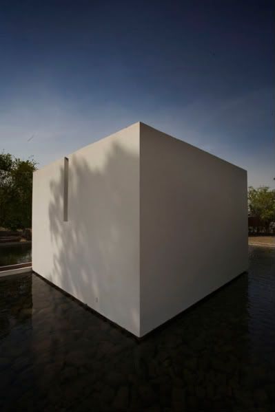
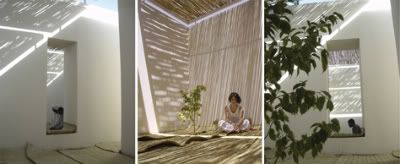
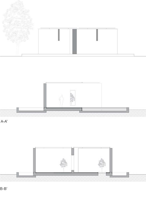
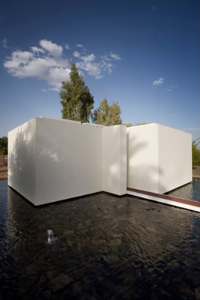
Prayer & Meditation Pavillion Exterior 1In Sudan, a pavilion for prayer and meditation for all faiths by Studio Tamassociati + one of the winners of year 2oo8 AR Awards for Emerging Architecture, comprising Shirley Blumberg (KPMB, Toronto), Jo Noero (Cape Town), Peter Davey (Former Editor of The Architectural Review), Shuhei Endo (Osaka), Peter Cook (London), and Paul Finch (Editor of The Architectural Review and Chairman) as the awards juries.

"create an enclave that could be spiritually neutral, yet still evoke a sense of the numinous" in a region that is suffering from religious and ethnic strife.
-Studio Tamassociati.
Prayer & Meditation Pavillion Exterior 2This independent building is an integral part of the recently realized Cardiac surgery centre in Sudan, built by the Italian humanitarian organization, Emergency NGO + is the only one of its kind to provide free health-care to patients in an extensive area within a 1o million square km radius and counting 3 hundred million inhabitants.

Planned and designed by Studio Tamassociati, Venice-based Italian architects, it is simply 2 cubes subtlely floating on a large reflecting pool, a powerful symbol of physical sustenance in sub-Saharan Africa, which also separates the pavilion from the hospital and wider world. There is just a narrow walk-path leading towards spaces with no symbols and elements that are specific to only one religion because the Popular Republic of Sudan is a country that, over the past twenty years, has been scourged from numerous Inter-ethnic as well as Inter-religious wars.

"We obviously had to seriously consider the Muslim faith, which is the religion of the majority of the Sudanese, along with the religion’s rules (ablutions, separation of men and women), but we decreased the contextual impact of those rules in order not to make them appear dominant. This was made possible by concealing all symbols and elements that are specific to only one religion. For example, the ablution area is nothing more than a higher water spray that, before entrance, allows for washing without connoting a strong religious symbol, and it is simply perceived as an element of the water pool." -Studio Tamassociati.
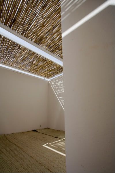
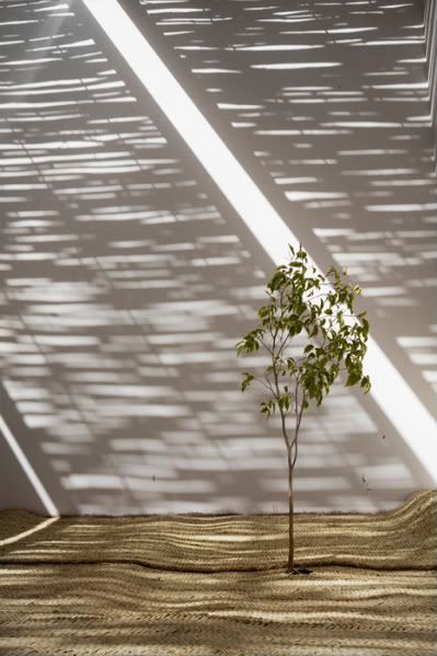
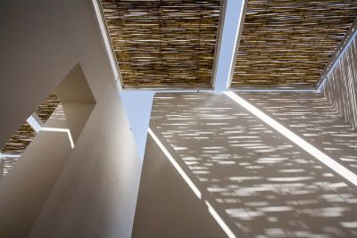
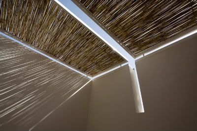
Prayer & Meditation Pavillion Interior 1Prayer & Meditation Pavillion Interior 2Prayer & Meditation Pavillion Interior 3Prayer & Meditation Pavillion Interior 4Prayer & Meditation Pavillion Interior 5Prayer & Meditation Pavillion Interior 6Prayer & Meditation Pavillion Exterior 3Prayer & Meditation Pavillion drwg 1Prayer & Meditation Pavillion drwg 2Prayer & Meditation Pavillion drwg 3a+. studio tamassociati via via
Read more...
Tuesday, 16 December 2008

Mourning House- Simple Stunning Architecture o9

Mourning House Exterior 1Mourning House Sketch 1Mourning House Sketch 2The Mourning House in Mexico City, Mexico by Pascal Arquitectos is a project with very strong emotional implications.
Between understanding the mood of the user, who at that particular moment would not care much to analysis any place for its aesthetic value, and from the design aspect of wanted to create a space that can lift-up spiritual mood, Pascal Arquitectos did not only refered to ancient buidings that were designed for this purpose, as the Egiptian “Mastabas” or some Mayan buildings in Palenque but they were also guided by several groups of Rabbies because of Religious rules and buildings codes in the Jewish Religion are very strict for this kind of places.

"A project of this nature must encourage introspection and peaceful visual harmony through a discrete use of materials and lighting. "
-Pascal Arquitectos
Mourning House Exterior 2Mourning House Exterior 3Mourning House Exterior 4Mourning House Interior 1Mourning House Interior 2Mourning House Interior 3Mourning House Interior 4
Mourning House Interior 5Mourning House Interior 6Mourning House Interior 7Mourning House Interior 8Located in a residential area and as planned to isolate the building from its surroundings, the building facade is completely covered by Grissal flamed granite with only an indoor illuminated yard to provide natural-light source. A 6´4” wide + 30´ height triangular shaped wooden door welcome visitor s by leading them to an access tunnel in the same shape, creating a solemn atmosphere as you enter but at the entrance ends, the hallway opens to a large, double height granite hall illuminated by the northern light coming from the indoor courtyard with a tall Dracaena at the center and a symbolical abstract sculpture by artist Saul Kaminer as the only artwork piece for decoration.

No furniture was used inside this place,
only a floating bench surrounding the room,
that is made out of the same wood used in all the building.
It also serves to hide all of the air conditioning,
speakers and recessed lighting which adds a dramatic touch.
This way the rooms shows no added ornament but
the light and shades playing on the granite volumes.
The ceiling is made of dark cumaru wood and floats without touching any wall
and a skylight puts a highlight on this detail.

Ground Floor Plan

Longitudinal Section 1

Longitudinal Section 2

Cross Section 1

Cross Section 1

a+. pascal arquitectos via via
Read more...

Monday, 15 December 2008

Yoshitomo Nara

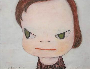
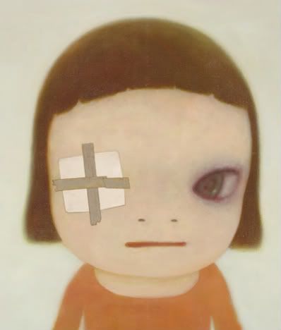
Yoshitomo Nara 1I first saw Yoshitomo Nara's work when i was in Ubud, Bali 3 years ago in an art shop, i guess. This cute face, oversized head with pinprick nose & tight pursed lips peeking into a world that seems eerily familiar through his persimmon pit-eyes...captured me. Then again on March this year at The Jim Thompson House in Bangkok, those familiar eyes...

from time to time I am like a child
from time to time I really am a child
from time to time I am like an adult
however (I) cannot truly become an adult
-Yoshimoto Nara
Yoshitomo Nara 2Yoshitomo Nara 3Born in 1959, the artwork of Yoshimoto Nara precedes the artist's own name. A long-term resident of Cologne, Nara having already exhibited in Milwaukee, L.A., Cologne and Seoul, with New York scheduled for later this year. The artist's Tokyo dealer, Tomio Koyama says that a major Nara sculpture was recently purchased by an American collector, and is earmarked for long-term loan to the San Francisco Museum of Modern Art. With a couple of books both in their second run, a limited edition wristwatch and a clothing line that incorporates motifs from his artwork, Nara is well on his way to developing a cult following in Japan.

The young and vulnerable, Yoshimoto Nara was often left to entertain himself, playing games and using his imagination to pass time resulting a deep sense of loneliness just like many of Nara's work, where the kids are always engaging in innocuous solo activities: holding a flag, playing in a box, sitting on a potty, holding a book, standing in a puddle. But sometimes they are brandishing sharp little implements--knives and saws. Capturing these scenes in a moment of stillness,
the children look up at the viewer with what seems to be an air of wariness or is it complicity?
do those heavy eyelids indicate post- or pre-nappy time
or do they embody a jaded cynicism,incongruent with the insouciance of childhood?

Each work is an emotional trigger which has different effects on different viewers.

Deep Deep Water Puddle

where is this place
how did I come to be here
looking around the restrictive shallows
the light from the sun glitters on the water's surface
I walk slowly while submerged in the water
walking in scattered patterns like the other children
without passing one another
keeping a certain distance
expressionlessly passing by one anotherthere seems to have been the sound of a helicopter above my headregardlessly I continue forward through the shallowswater clings heavily around my legswhile feeling my own existencein the deep deep puddlewhile having a dream of drowning
-Yoshimoto Nara


Yoshitomo Nara 4
Yoshitomo Nara 5
Yoshitomo Nara 6
Yoshitomo Nara 7
Yoshitomo Nara 8

a+. yoshitomo nara via the-artists.org via christie's via wikipedia
Read more...