Saturday, 28 June 2008

Milkit

Milkit 1I have the utmost respect for designer who recycle what more they who teaches u to do it too.
Milkit by Alexandru Adam and Steven Koch at Play Design is a kit designed to assist you in turning a milk bottle in to a stylish table lamp.
Encourages sustainability in the home, giving all age groups an insight in to an alternative way of recycling. The kit contains everything you need to create your own lamp including a range of beautiful graphics for individual personalisation, all you require is a plastic milk bottle which can be either a one, two, four or six pint bottle. -kontrast blog
Milkit 2 a+. Play Design via Read more...

Corporate Identity for a Pediatricion

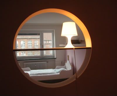
Clinic interior 1 If I ever fall sick, I want to be a child again so that I can go to this clinic.'>

I love the color combination & the happy sun-shinning ambience portrayed. It makes anyone who walks in feel great & alive again!

Factordesign together with the interior architecture of Susanne Beissner-Schindler, help to delevoped the clinic Corporate Identity when Dr. Uhlig wanted to refurbished his clinical practice, bearing in mind that Dr. Uhlig wants his little patients to feel comfortable when they enter the practice for a checkup, examination, or immunization.
The result: strong contrasts colors of orange and light blue (as primary colours attract kid's and make the design clear and remarkable.) for the interior that also give a certain warmth to the Corporate Design.

Clinic interior 2Clinic interior 3 Strong contrast color with funny wallpapers in the corridors.
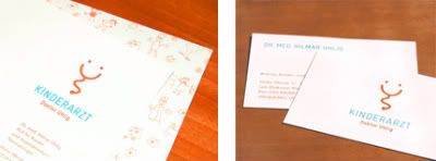
Clinic Stationary and business cardsStationary and business cards inspired by a stethoscope, the most well known tool of a doctor combined with a laughing face.
a+. factor design via Read more...

Pluk-Good food is great fun

Pluk 1 Deliciously pink!
For Tjep (Pluk's designer), healthy means fun too! The design team not only resposible in designing the interior for Pluk but they came out with the identity & name for the shop for Client, Aïda & Zeger too.
Located in Haarlem, Netherlands, with a new take-away formula which offers: fresh juices, yogurt shakes and special salads that customers can compose by themselves, Pluk emphasis on good food does not means boring food.
The interior tries to reflect this juxtaposition of healthy and fun. For some reason healthy wants to look boring but we just said no! The counters contain fruits and vegetables in three color groups. They are actually fake, but because of the way we integrated a special gradient effect the whole counter becomes simply delicious, by the way it took us months to develop the exact right color, gradient and fruit/vegetable combination to get this result: people who enter Pluk are overwhelmed and just cant resist ordering one of the wonderful specialities specially prepared by Aïda and Zeger. -Tjep


Pluk 2Pluk 3Pluk 4a+. Tjep Read more...

Friday, 27 June 2008

vh1 holiday card

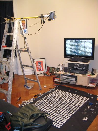
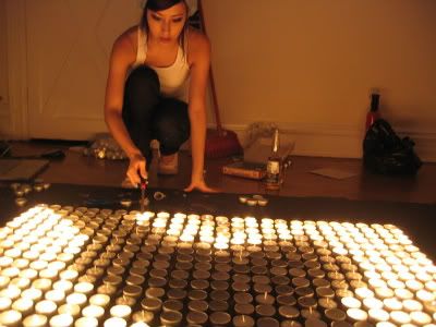
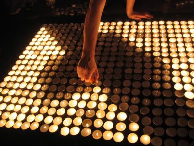
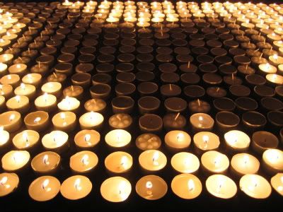
vh1 holiday card, behind the scene 1 Nice huh? Wait until u see this stop motion animation with candles ...

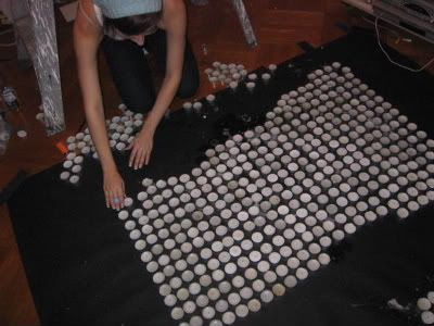
Check-out vh1 behind the scenes pictures.vh1 holiday card, behind the scene 2
vh1 holiday card, behind the scene 3
vh1 holiday card, behind the scene 4
vh1 holiday card, behind the scene 5
vh1 holiday card, behind the scene 6
a+. behance
Read more...

Organic sanitary fittings by Amin Design

Amin Design 1 Elegant swan-like wash basin...
German designer Bouchti Amin's organic like design..
Amin Design 2
Does this looks like a bird with a beak open to u?
Amin Design 3 These look like ducklings to me...

Amin Design 4 A serpent bursting out water.

Amin Design 51/2 of a half-bolied egg with the yolk scrapped out with 2 horns? hmmm...
a+. amin design via
Read more...
Thursday, 26 June 2008

Fancy Floor

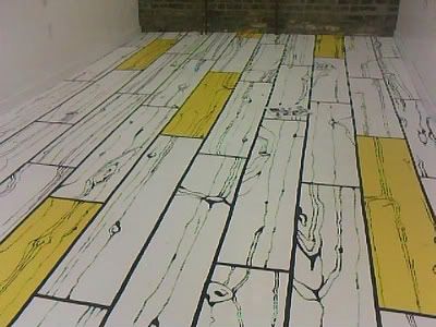
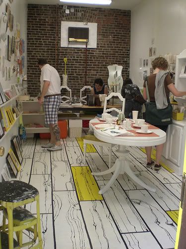
fact & fancy's floor 1 Saw this on poppy talk. It is a nicely done hand painted floor in a shop called Fact & Fancy in Brooklyn .
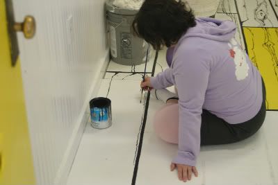
artist on fact & fancy's floorI can't help it but from this artist back she just looks like my friend, Shep.'>

fact & fancy'sIn shop view.

Read more...

Dunk Mug

Dunk Mug Nice. Cool.'> I want one.
a+. firebox via

Read more...

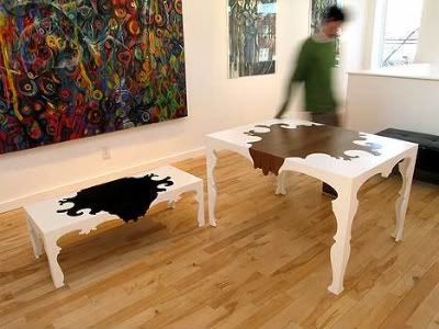
Justin Couch Table's Evolution

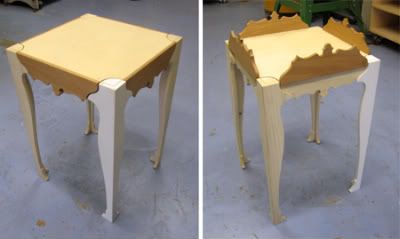
EvolutionAlexander dining table + side tabeIt’s taken a long time, but Jeff and I have finally figured out this here end table. It began way back when I was making my tables and we thought that this kind of look would work well as a whole line, but we needed to simplify a lot of things. So we started with an end table. Very quickly we used the leg shape that I was already using in the dining table and came up with this. -[de]sein
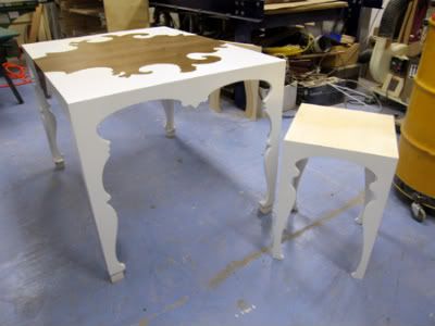
It all started with Justin Couch’s Wilhelm coffee table and Alexander dining table. They are classic furniture with contemporary touches that are made of Baltic birch but with Alexander that makes use of a walnut veneer too.
Wilhelm coffee table and Alexander dining tableAlexander dining table 1Alexander dining table 2Alexander dining table 3 a+. justin couch design via Read more...
Wednesday, 25 June 2008

Karim Rashid's Globalight

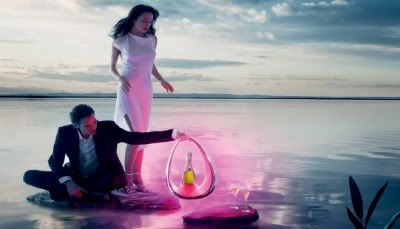
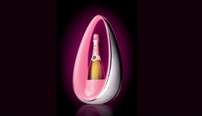
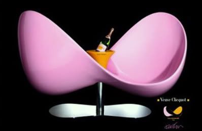
Globalight 1Globalight 2Globalight, a limited-edition champagne cooler designed to mark the celebration of Champagne house Veuve Clicquot's Rose Champagne.“We are delighted to collaborate once again with the talented Karim who also crafted our Veuve Clicquot Loveseat,” explained Cecile Bonnefond, President of Veuve Clicquot Ponsardin. One bottle of Veuve Clicquot Rose will remain chilled for 4 hours and the LED lights will give a soft glow for the same time, making Globalight a good accessory for outdoor entertaining. -Frame Magazine.
Below, Veuve Clicquot Loveseat.

a+. karim rashid

Read more...

quotes of the day

- marilyn monroe via


Read more...

Tuesday, 24 June 2008

The Pod Hotel,NY- Hip Budget Hotel I Heart o1

the pod hotel I was attracted by the pod hotel webpage's colorful graphic at first...
I then browse through their gallery & found these...
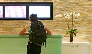
pod's receptionPod's very simple reception.

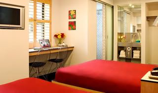
double-double pod Double-double pod.

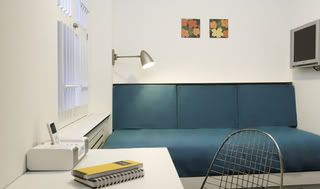
single pod Single pod.

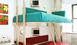
pod's bunk Pod's bunk.
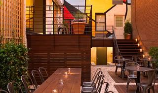
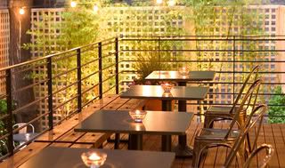
Pod's open-air restaurant 1Pod's open-air restaurant 2 Pod's open-air restaurant, i guess...

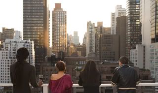
pod's rooftop Pod's fascinating rooftop view.

pod's loungePod's very chic lounge...and i'm in love with this hip, convenient, and personalized accommodations for the stylish and spendthrifty traveler. Formerly the Pickwick Arms, the Hotel is located in the heart of Manhattan's Midtown East neighborhood, and is New York's number one choice for visitors on a budget.
Read more...
Monday, 23 June 2008

Duffy London GLO Canvas

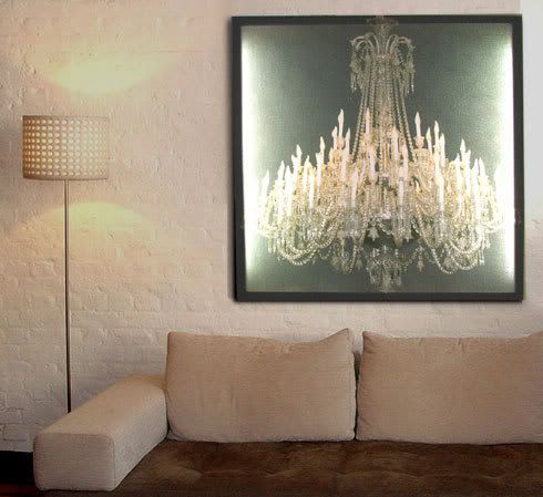
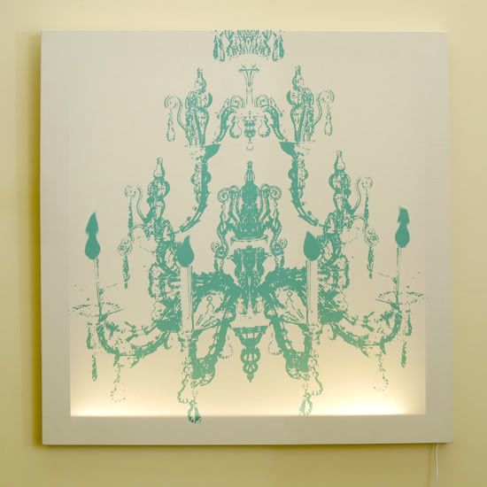
GLO Canvas 1Part baroque and part minimalist chandelier lighting, by DuffyLondon, a.k.a. Chris Duffy—a young, cool, hipster of the London design field.
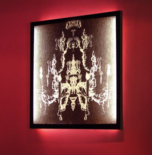
GLO Canvas 2GLO Canvas 3GLO Canvas 4These light fixtures are digitally printed on canvases & it's a complement to your room art pieces too. DuffyLondon executes fantastically simple ideas with the greatest of style.
His textile prints are as fearless as they are fashionable and as well suited to a formal dining room as a college dorm room. By using his humorous graphic designs for wall and hanging lights he's building a body of work fueled equally by edginess and utility. -design public

Read more...
Oyule

'A modern-day lightbulb that has travelled back in time, providing light as a traditional oil lamp.'-industrial designer Sergio Silva.

Read more...