Friday, 3 April 2009

VENUS- The Natural Crystal Chair That Grows in An Aquarium

VENUS 1VENUS 2VENUS 3
"A form born from nature has a beauty that exceeds our imagination."
- Tokujin Yoshioka.

Venus, a natural crystal chair that was 'breed' in an aquarium using the laws of nature. The tiny crystals 'make its appearance over time as if the goddess herself gradually emerges from water.'

Venus embodies a beauty born in coincidence with a state-of-art that pushes the boundaries of creativity.

VENUS 4VENUS 5VENUS 6VENUS 7VENUS 8VENUS 9VENUS 10
Photographs taken by Masaya Yoshimura from 21_21 DESIGN SIGHT, Exhibition 4. Installation named 'Second Nature' which is directed by Tokujin Yoshioka, the creator of VENUS.


VENUS 11VENUS 12VENUS 13VENUS 14VENUS 15VENUS 16The making of VENUS...

Read my post on Tokujin Yoshioka's Tofu Light-fixture.

a+. tokujin yoshioka
Read more...

Wednesday, 1 April 2009

L House- White House With Pink Accent & A Fascinating Library

L House 1
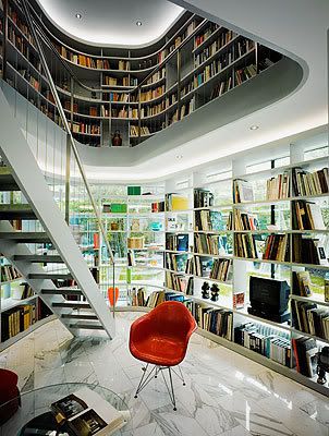
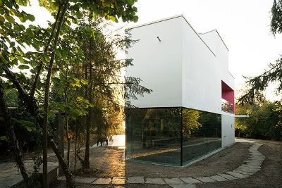
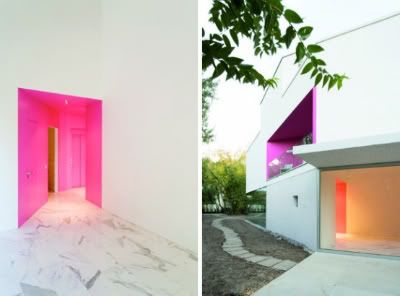
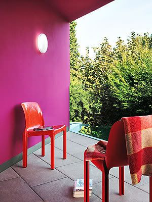
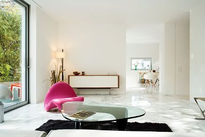
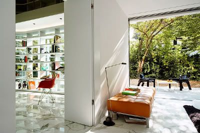
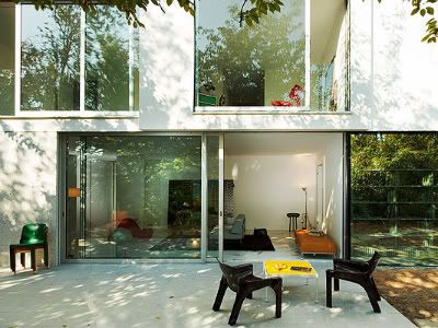
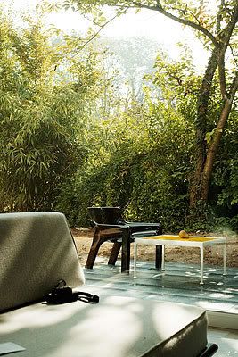
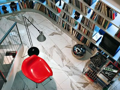
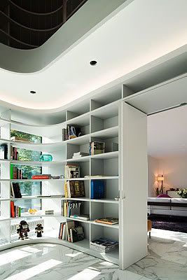
L House, designed by Philippe Steubi Architekten GMBH. At first glance, the pink accent on this very white house catches my attention but I am much more fascinated by the house library after flipping through the photographer, Dominique Marc Wehrli's work of art.

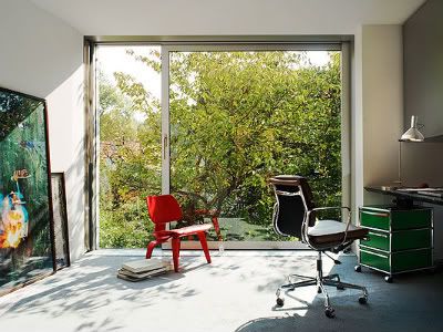
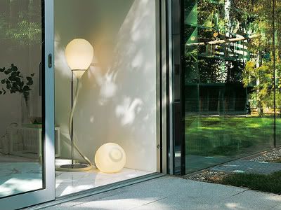
"The three-sided glazing of the library in the ground floor is mirrored-glass. Depending upon time of day and lighting conditions you can see the stored books or the reflected graden. The uppper floors are implemented in bright lime rendering and the glazings in nature-anodized aluminium."

- Philippe Steubi Architekten GMBH
L House 2L House 3
'This expressive volumetry is a result of the particular form of the plot and the requirement of the constuctor to place a maximal volume on the plot. The space allocation plan was incorporated in this scuptural body by the method of hollow out.

The concept was to string together the requested spaces to one movement going through the house: stretching, extending, narrowing, grinding out form the mass, to a coherant sequence of spaces according to the principle of the enfilade.

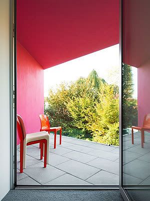
Each room receives its completely specific character in size and form (conical entry area with wardrobe and guest WC., large cubic double-storey entrance hall, triangular loggia as color area, double-storey inside rounded library which is downstairs three sided glazed , etc.) so that when entering and going through the house various and surprising space experiences occur.The ground floor walls consists of large washed-out concrete elements (white carrara marble balls with white cement) which are interupted by space-high glazings.'

L House 4L House 5
L House 6L House 7L House 8L House 9L House 10
L House 11
L House 12L House 13a+. philippe steubi architekten gmbh
a+. dominique marc wehrli via digs digs
Read more...