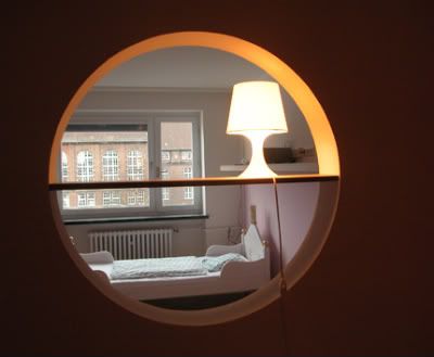
I love the color combination & the happy sun-shinning ambience portrayed. It makes anyone who walks in feel great & alive again!
Factordesign together with the interior architecture of Susanne Beissner-Schindler, help to delevoped the clinic Corporate Identity when Dr. Uhlig wanted to refurbished his clinical practice, bearing in mind that Dr. Uhlig wants his little patients to feel comfortable when they enter the practice for a checkup, examination, or immunization.
The result: strong contrasts colors of orange and light blue (as primary colours attract kid's and make the design clear and remarkable.) for the interior that also give a certain warmth to the Corporate Design.

 Strong contrast color with funny wallpapers in the corridors.
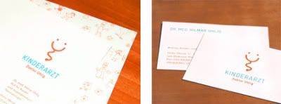
 Stationary and business cards inspired by a stethoscope, the most well known tool of a doctor combined with a laughing face.


No comments:
Post a Comment