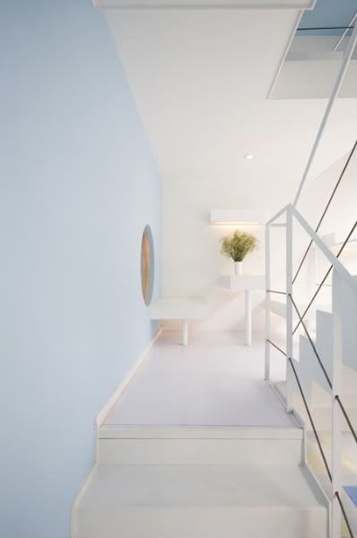
 Completed the end of 2oo7 by design studio KUU, Super Sense Spa is not the kind of super duper interior that would amaze u immediately. Infact, some might thing that this place is too white, too plain, unzen, not architectural & so on but deep down inside, first sight of it makes me calm & want to relax. Maybe it's the lighting, maybe it's the plain whiteness, maybe it's the bareness of the interior that only strengthen by the lines of the staircase railing or maybe it is just because of when walls are thin, they are worked on to give decorative effects with light. When they are deep, they become shelves or form spaces.-Marcus Fairs, dezeen.
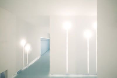 Walls which is light-fixtures as well.
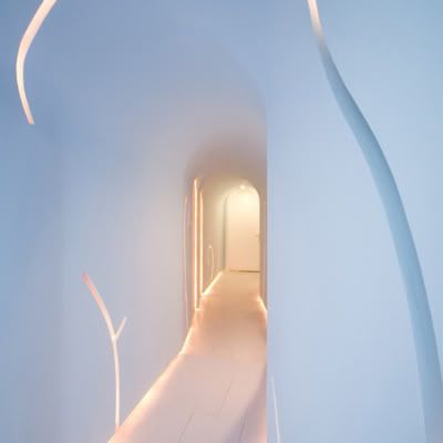 Note the skirting details too!
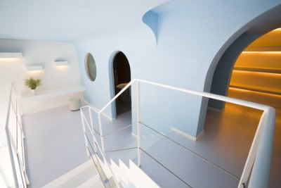 Walls formed spaces...
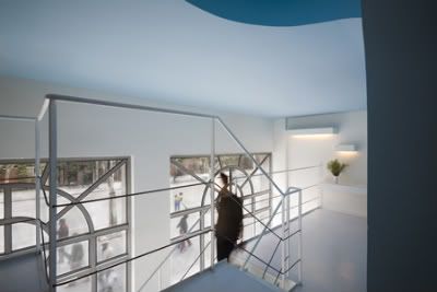 a+. kuu world via
Thursday, 18 September 2008
Super Sense Spa
Labels:
interior design,
light fixture
Subscribe to:
Post Comments (Atom)


No comments:
Post a Comment