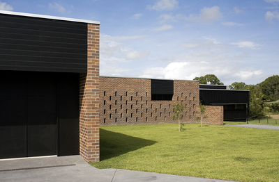
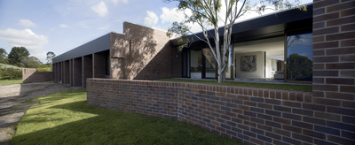
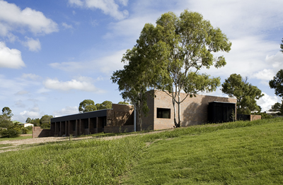
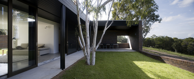
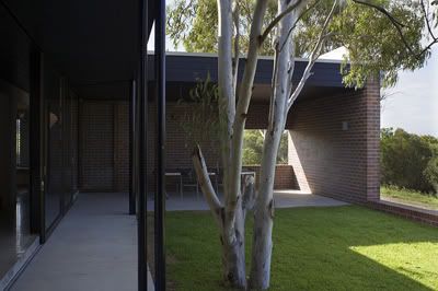
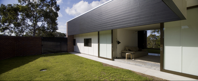
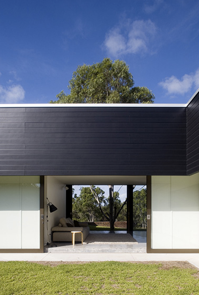
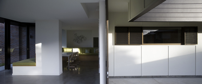
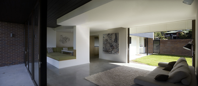
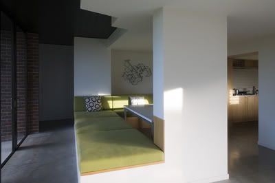
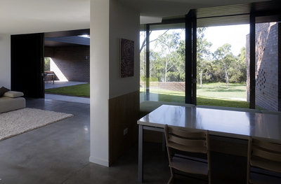
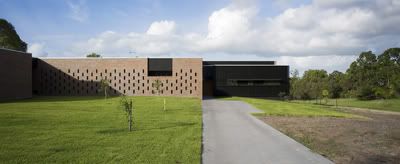
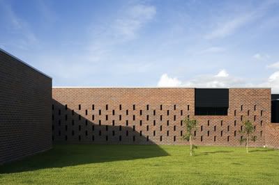
By Owen and Vokes Architects, the Hervey Bay Farmhouse in Queensland, Australia was completed in year 2oo8. The house is designed to accommodate 3 generations of the owner family. On the entry elevation, the large, centrally-placed brick screen is a shared facade that mediates depth, separation and privacy. While on the rear elevation, brick piers break the walls into 9 room-sized facades, giving each room, and therefore each generation its very own private landscape outlook.
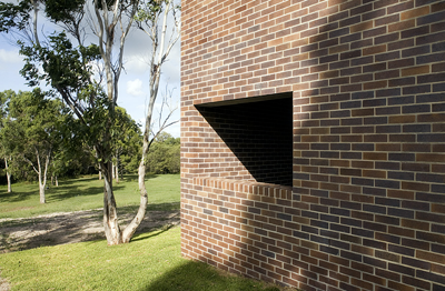
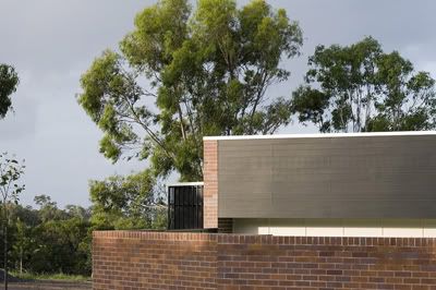
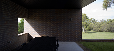
'During our first inspection of the site we came to the conclusion that we would build in brick. We seek appropriate reactions to settings. All of the neighboring houses were built in brick and we didn’t want our clients to unnecessarily oppose the established trend.We also seek a timeless presence in architecture. Bricks are neither pretentious nor fashionable. The bricks have been bonded in a humble way using a struck-flush mortar finish. We let sunlight embellish the large planes of red brick. As brick walls are the staple of the garden and the house, we were able to make seamless thresholds between interior and exterior realms. We have a preference for monumentality. Bricks allowed us to anchor the house to the site and to the ground - the territory of the child, and therefore of the family. On a simple conceptual level, we start with brick wall enclosures - poetically somewhat likened to a ruin such as those at St Helena Island. Internal and external rooms, lined in plasterboard or fibro, then occupy the enclosures.'
- Owen and Vokes.'During our first inspection of the site we came to the conclusion that we would build in brick. We seek appropriate reactions to settings. All of the neighboring houses were built in brick and we didn’t want our clients to unnecessarily oppose the established trend.We also seek a timeless presence in architecture. Bricks are neither pretentious nor fashionable. The bricks have been bonded in a humble way using a struck-flush mortar finish. We let sunlight embellish the large planes of red brick. As brick walls are the staple of the garden and the house, we were able to make seamless thresholds between interior and exterior realms. We have a preference for monumentality. Bricks allowed us to anchor the house to the site and to the ground - the territory of the child, and therefore of the family. On a simple conceptual level, we start with brick wall enclosures - poetically somewhat likened to a ruin such as those at St Helena Island. Internal and external rooms, lined in plasterboard or fibro, then occupy the enclosures.'

Site Plan.
(click for a clearer view)
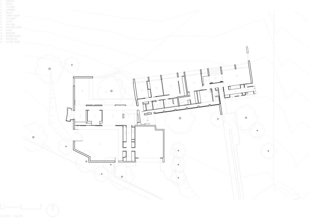
Layout.
(click for a clearer view)
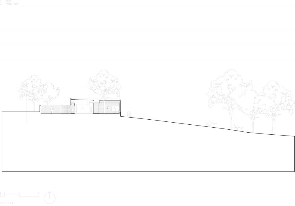
Section.
(click for a clearer view)
a+. owen and vokes via




1 comment:
I really do like the architecture of this building, however it does remind me of a prison chapel aka Prisnor Cell Block H! :)
Post a Comment