'A secret garden, stone ruins, a uniquely dense archaeological site'are the most impressive symbol of "Kolumba" in Cologne’s city centre, Germany which almost completely ruin during World War II.
Intended to be a place for reflection, Kolumba Art Museum designed by Peter Zumthor, year 2oo9 Pritzker Architecture Prize Laureate 'transfers sum of the existing fragments into one complete building, thus the new building becomes a part of the architectural continuum.
With warm grey bricks the new massive building unite with the tuffs, basalt and bricks of the ruins which makes it looks as if the new building develops seamlessly from the old remains whilst respecting it in every detail. The architect, Peter Zumthor has amazingly restores the lost core of one of the once most beautiful parts of Cologne’s city centre.'
- World Architecture News.Intended to be a place for reflection, Kolumba Art Museum designed by Peter Zumthor, year 2oo9 Pritzker Architecture Prize Laureate 'transfers sum of the existing fragments into one complete building, thus the new building becomes a part of the architectural continuum.
With warm grey bricks the new massive building unite with the tuffs, basalt and bricks of the ruins which makes it looks as if the new building develops seamlessly from the old remains whilst respecting it in every detail. The architect, Peter Zumthor has amazingly restores the lost core of one of the once most beautiful parts of Cologne’s city centre.'
"The program of the building is a combination of a small church, an archeological site and a museum. The chapel has its own entrance from the street and is build on the inner foundations of the church that once stood here. The other foundations are on display inside and integrated in the exterior wall. In the wall the old structure functions as ornament, similar to the ornamental Kraanspoor building in Amsterdam and the ornamental Caixa Forum in Madrid.
A second entrance provides access to the museum. From the entrance hall there is a big double door and a small stairway leading upstairs. The doors open onto the dark space of the archeological site, for which almost the entire ground floor is reserved. The stairs lead to two stories of traditional museum space.
Behind the double doors a vast space opens up. As a visitor your movement is restrained to a zigzagging boardwalk. The light that comes through the brick screens give the space an almost sacred ‘aura’. In combination with the high position of the screens and the vertigo effect provided by the slender columns, it feels like a far echo of the architecture found in some large Gothic churches or cathedrals. Whereas the boardwalk triggers you to look at the foundations here on display, the architecture around recreates the atmosphere of the construction that once stood on these foundations. Peter Zumthor brought the spirit of this place back to life."
"After this space the upper two floors make perfect sense. The exhibition shows pieces found in the excavation of the church below. This is however freshly combined with modern (religious) art.
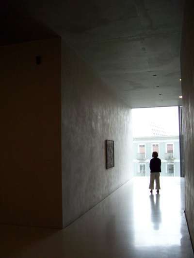
The layout of the exhibition is structured by a snaking open gallery space, on which some smaller rooms open up to. Fascinatingly a cut runs all the way around the floor of the main gallery. The floors of the adjacent rooms are a little higher.
The idea of the cave is elaborated in the materialization of the space. All surfaces in the exhibition space are solid – like it is carved from a piece of rock. Furthermore all floors, walls and ceilings are waving a little - questioning the idea of the flat surface and thereby questioning the definition of the space itself. With all surfaces waving, the space itself starts to shiver. Surreal."
- Eikongraphia.A second entrance provides access to the museum. From the entrance hall there is a big double door and a small stairway leading upstairs. The doors open onto the dark space of the archeological site, for which almost the entire ground floor is reserved. The stairs lead to two stories of traditional museum space.
Behind the double doors a vast space opens up. As a visitor your movement is restrained to a zigzagging boardwalk. The light that comes through the brick screens give the space an almost sacred ‘aura’. In combination with the high position of the screens and the vertigo effect provided by the slender columns, it feels like a far echo of the architecture found in some large Gothic churches or cathedrals. Whereas the boardwalk triggers you to look at the foundations here on display, the architecture around recreates the atmosphere of the construction that once stood on these foundations. Peter Zumthor brought the spirit of this place back to life."
"After this space the upper two floors make perfect sense. The exhibition shows pieces found in the excavation of the church below. This is however freshly combined with modern (religious) art.
The layout of the exhibition is structured by a snaking open gallery space, on which some smaller rooms open up to. Fascinatingly a cut runs all the way around the floor of the main gallery. The floors of the adjacent rooms are a little higher.
The idea of the cave is elaborated in the materialization of the space. All surfaces in the exhibition space are solid – like it is carved from a piece of rock. Furthermore all floors, walls and ceilings are waving a little - questioning the idea of the flat surface and thereby questioning the definition of the space itself. With all surfaces waving, the space itself starts to shiver. Surreal."


 a+. world architecture news
a+. eikongraphia
a+. danda via


No comments:
Post a Comment